STIN300 - Day 5
Lars Snipen • Jon Olav Vik
1 Today’s learning goals
A copy of the live demo from this day can be downloaded as day5_demo.Rmd.
First, a look at the stat component of ggplot.
Stats compute new variables that you can map to aesthetics. Usually you add either a stat or a geom to a plot layer, and it will pick a default for the other component. For example, ?geom_bar has a default stat = "count", which means it uses the stat_count() function to compute what goes on the y axis.
library(tidyverse)ggplot(data = mpg, mapping = aes(x = class)) + geom_bar()
Here, we only specified what variable to map to x, and geom_bar() asked stat_count() to compute y values. We could make the same plot with:
ggplot(mpg, aes(class)) + stat_count()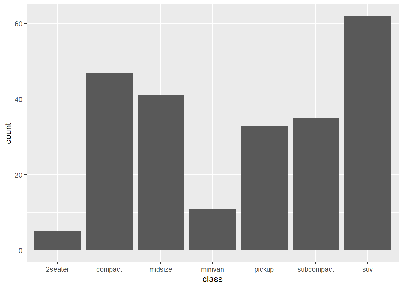
As you see from ?stat_count, its default geom is “bar” (which points the way to geom_bar()), but you can also choose your own.
ggplot(mpg, aes(class)) + stat_count(geom = "point")
To use such computed variables, you wrap them in stat(). For instance, to plot a histogram with proportions instead of counts, we can map stat(density) to y.
ggplot(data = mpg, aes(x = hwy, y = stat(density))) + geom_histogram()## `stat_bin()` using `bins = 30`. Pick better value with `binwidth`.
Look at ?stat_density and scroll down to Computed variables to see what computed variables this stat provides.
References:
We continue with some data wrangling using the tidyverse set of functions.
- Learn how to merge tables
- Binding rows or columns
- Joining by some column(s)
- Learn how to re-arrange data in tables
- Gather data from several columns into one (two)
- Spreading data in one column into several new columns
- Then learn a few more ‘verbs’ for table manipulation
- Understand how select-helpers can be used to select many columns
2 Brief recap
Yesterday we started looking at the ‘verbs’ in tidyverse, i.e. function we use to do something to data tables.
select()slice()filter()arrange()mutate()summarise()group_by()
Specifically, we saw some examples of split-apply-combine type of operations. This means we group the rows according to some factor (or something that can be coerced into a factor). Then we use summarise() to apply some function(s) and compute something for each group. This results in a new table with the groupwise results.
2.1 Exercise - European capitals
From babynames compute how many children have been given names of some European capitals over the years. First, filter cases with names equal to one of
capitals <- c("Oslo", "London", "Paris", "Vienna", "Rome", "Madrid", "Athens")Hint 1: Use the operator %in% (search internet for help). Next, sum the number of children with each name, and make a plot like above (geom_col()), but with log-transformed y-axis. Also, try to make the capitals appear in ascending order by the number of children.
Hint 2: Use reoorder() by the sum of children).
Write the code into a single pipeline (except for the first line given above).
3 The universe of tidy data - tidyverse
Now that we have started using functions from the tidyverse packages, let us briefly have a look of what is meant by ‘tidy data’.
A tidy data set consists of data in tables. Remember that R in many ways has been built to handle tables effectively, and data that cannot be represented as tables can probably be handled at least as effective with other tools (e.g. Python). Also, it is a convention that
- Each column of the table is a variable.
- Each row of the table is a case or object.
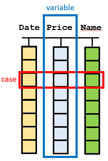
Figure 3. A visualization of tidy data. Data are arranged in a table, where each column is a variable and each row is a case.
What is a variable? Well, this can be tricky because it varies from data set to data set. In general, we think of variables as properties that we measure. Here are some examples:
- In the
airqualitydata set, we measure some properties of the air quality. Each new property is a new column. We measure this over several days. Each new day is a new case. All time series should be represented this way, each timepoint a new row. - In the
babynamesdata set, we measure/count/observe some properties of names given to babies. Each property is a new column. Each new baby is a new case. - We collect some biological samples, and from each sample we measure/count/observe a number of properties (e.g. gene expression, microbiota composition, blood pressure, body temperature, weight, gender etc.). Then these properties should be arranged as columns, and each new sample is a new row.
Even if this is a guide, there will always be situations where it is not obvious what is a variable and what is a case. It may even vary for the same data, depending on what we are investigating. Thus, we will below see some functions for quickly re-arranging tables to fit our needs.
Data can be tidy in just one way, but ‘messy’ in infinite many ways!
3.1 Binding tables
Often our data resides in several tables, not only one. Let us see how we can merge tables.
If we have two tables (data.frame or tibble) with the same cases (rows), but different variables, we can column-bind them together by the bind_cols() function in tidyverse, or the cbind() function in base R. We create two small tibbles to illustrate:
library(tidyverse)
band <- tribble(~name,  ~band,   # tribble for typing in small tables
                "Mick", "Stones",
                "John", "Beatles",
                "Paul", "Beatles")

artist <- tribble(~plays,
                  "vocals",
                  "guitar",
                  "bass")
Both tables have 3 rows that describe the same cases, and we column-bind them:
cbound <- bind_cols(band, artist)You column-bind tables if all rows are the same cases, but columns are distinct.
Opposite, if we have two tables with the same variables, but different cases, we use either bind_rows() from tidyverse or rbind() in base R.
band2 <- tribble(~band,     ~name,
                 "Stones",  "Keith",
                 "Beatles", "Ringo")

rbound <- bind_rows(band, band2)
If your tables have column names (they should!) then the columns may not appear in the same order in the two tables, and still these functions will bind them correctly, using the column names to make certain columns are correctly bound.
Such simple binding is almost always possible, but make certain that all rows describe the same cases (and in the same order) if you column-bind, and that all columns describe the same variables if you row-bind.
Sometimes we just want to add a row to an existing table:
band %>%
  add_row(name = "Charlie", band = "Stones", .before = 1)
## # A tibble: 4 x 2
## name band
## <chr> <chr>
## 1 Charlie Stones
## 2 Mick Stones
## 3 John Beatles
## 4 Paul BeatlesThe option .before may be used to indicate where to input the new row, here 1 row before the top of the table. Use the option .after to add after the specified row.
3.2 Joining tables
Quite often we have tables where cases or variables partly overlap, but a simple column-bind or row-bind is not a good idea. Consider this example:
band <- tribble(~name,  ~band,
                "Mick", "Stones",
                "John", "Beatles",
                "Paul", "Beatles")

instrument <- tribble(~name,  ~plays,
                      "John", "guitar",
                      "Paul", "bass",
                      "Keith","guitar")
We see that the columns are partly different, and that case 2 and 3 in the first table corresponds to case 1 and 2 in the second. To merge such tables we must join them.
First let us join band with instrument, and use the name variable to join them:
ljoined <- left_join(band, instrument, by = "name")Inspect the result to understand how this works. Notice that the row with "Keith" in instrument was lost in the joining, but all band rows are intact. There is also a right_join() function, and what is the difference? Let us find out:
rjoined <- right_join(band, instrument, by = "name")The cases (rows) in the joined table are determined by the second (‘right’) input when we used this version. Could we not just switch the order of the inputs, do we really need both left_join() and right_join()? Yes, because often the first input comes through the pipe-operator, and we cannot just switch the order of the inputs.
In both cases above we lost some cases (rows). If we want to keep all we use full_join():
fjoined <- full_join(band, instrument, by = "name")The use of full_join() will often lead to missing data (NA) in some cells, since no rows are discarded. The opposite is to only join rows who are complete across both tables, to end up with no missing values:
ijoined <- inner_join(band, instrument, by = "name")3.3 Exercise - flight delays
The package nycflights13 (part of the tidyverse installation) contains a tibble named flights and one named airlines. Let us use these data to find:
Which airline company has the largest arrival delays at these New York airports.
In flights there is a column arr_delay with arrival delay times, but there is no information about airline company. But, in airlines we have this, together with a column of carrier data. The same carrier data are also in flights!
Fill in the code below to complete the task:
flights %>%
  __________________ %>%     # join
  group_by(________) %>%
  __________________ %>%     # compute average delay per airline company
  arrange(______) -> delays  # sort with largest first
4 Re-arranging tables
Let us see how we can easily re-arrange tables by either stacking/gathering several columns into one column (table changes from ‘wide’ to ‘tall’) or the opposite, spreading cases in one column out into several new columns (table changes from ‘tall’ to ‘wide’).
4.1 Gathering variables
Here is a mini example data set:
cases <- tribble(
  ~Country, ~"2011", ~"2012", ~"2013",
      "FR",    7000,    6900,    7000,
      "DE",    5800,    6000,    6200,
      "US",   15000,   14000,   13000
)
It is not too uncommon to see data like this. What are the variables here? Should not the three years really be values in a column named Year? Well, for some analyses the original format may be proper, but let us see how we can stack the data in a different way.
We would like to have a column Year where we have the values 2011, 2012, 2013. All the values we have in the table above we put in a third column named Counts (or whatever we choose). Here is how we do this, by using the gather() function:
new.cases <- gather(cases, key = "Year", value = "Counts", c(2,3,4), convert = T)Notice the arguments. First, the data table we are wrangling, often this comes through a pipe and is not specified in the function call. In key we specify the name of the new column that arises when we stack the column names of the stacked columns. In value we give the name of the new column that arises when we stack the current values of the table. Next, we need to specify which columns we want to gather. Here we numbered them, we could also name them, use a range or name those we do not want to gather (a minus). Finally, we set convert = TRUE. This means that the column names ("2011", "2012", "2013"), who are texts, should be converted to numeric when they are used as values in the new table.
4.2 Spreading variables
The opposite of gather() is spread(). Here is another small example data set:
pollution <- tribble(~City,        ~Size, ~Amount,
                     "New York", "large",      23,
                     "New York", "small",      14,
                     "London",   "large",      22,
                     "London",   "small",      16,
                     "Beijing",  "large",      121,
                     "Beijing",  "small",      56  )
Is this a good format for analysis? Well, again it depends on what we are looking for. But, it could make sense to re-arrange this such that the value in the Size-column are actually two new column-names, replacing the existing Size and Amount columns. We use spread() to spread existing column out into new columns:
new.pollution <- spread(pollution, key = Size, value = Amount)Notice the arguments. First, as usual, the data. Then the key specifies the existing column to spread out as new column names. If this column contain numbers, they will be converted to texts. In such a case I would think twice, is it really a good idea to spread like this? The value argument specifies the existing column to use as values.
Note that in gather() the key and value arguments are texts, since they specify new names we are creating. In spread() they are not texts, but refer instead to existing columns that we are spreading.
4.3 Exercise - gather and spread
The tibble named table2 is included in tidyverse. Spread this table into the four columns country, year, cases and population. It should look like table1.
The tibble named table4a is included in tidyverse. Gather this table into the three columns country, year, cases. Do similar for table4b, gather into country, year, population. Join the two tables by both country and year. The result should again be identical to table1.
4.4 Exercise - air quality again
On day 3 we plotted three variables from the airquality data set as curves in the same panel, but the result was not pretty. Let us improve this. We have seen that in ggplot it is often a good idea to have data stacked, i.e. a tall table, and then have one or more grouping variable for either mapping to aesthetics or faceting.
Make a script that plots the variables Temp, Wind and Ozone against Day as curves in the same panel, and give each variable a separate color. Do this for all Months, but each month should appear in a separate panel, as in the figure below. Hint: Gather data such that Ozone, Wind and Temp are stacked before you plot.
It should look something like this:

Here is a short video with a suggested solution to this exercise
4.5 Filtering cases with missing data
In tidyr there is a function drop_na() for quickly filtering cases with missing data. Let us put a NA in the pollution data from above:
pollution$Amount[4] <- NAWe can filter out this row by
pollution %>%
  drop_na(Amount) -> new.pollution
The exact same could have been achieved by
pollution %>%
  filter(!is.na(Amount)) -> new.pollution
so it is fair to ask why we need drop_na(). Well, it is a shortcut to filter based on missing data in several columns. You can list several columns (comma-separated) and filter rows with missing data in any of them.
4.6 Finding unique cases
Sometimes we want to filter cases to obtain only the unique cases. How many unique cities are listed in the pollutiondata? To answer this, we can filter cases to have only one for each distinct name. The tidyverse function for doing this is distinct():
pollution %>%
  distinct(City) -> unique.cities
Notice that the resulting table only has one column, the one we used as argument to distinct(). To keep all the other columns as well, we use
pollution %>%
  distinct(City, .keep_all = TRUE) -> unique.cities.full
4.7 Specifying many columns
There are several tidyverse functions that operate on columns. We saw drop_na() and distinct() above, and yesterday we saw several. When using these functions you typically name some column, or several columns listed by comma separation. The latter can be cumbersome if we want to list many column names. Some data tables have many columns!
There are some nice functions known as ‘select_helpers’ that we may make use of to quickly name many columns, type ?select_helpers and return in the Console, and read the Help.
An example is starts_with(). If all columns I want to select starts with the letter "A" I can use starts_with("A") to select these columns. In the code above I could have typed
pollution %>%
  drop_na(starts_with("A")) -> new1
Other relatives of this function are ends_with() and contains(), but see the Help file for the full list.
Note that you specify a text as input to these functions. Any column name that matches this text (at the start, end or anywhere inside) will be selected. Make the text long enough to match exactly the columns you want. We will talk more about text processing next week, then we may have a closer look at these functions, or more specifically at the function matches().
If you want to select many columns, using select(), the syntax is the same as for drop_na():
pollution %>%
  select(starts_with("A")) -> new2
4.8 Select-helpers in other functions
Unfortunately, the straightforward use of the select-helpers does not apply to all the data wrangling functions we have seen. Two very useful functions from yesterday are mutate() and summarise(). We mentioned there are some versions of these named mutate_all() and summarise_all(), that operate on all columns. There are also two similar functions mutate_at() and summarise_at() that applies a function to a specified range of columns. There is also a filter_at() function that allows us to filter based on several columns. We can easily imagine the need for select-helpers here.
Let us use contains() in summarise_at():
iris %>%
  group_by(Species) %>%
  summarise_at(contains("Width"), max) -> new3
Run this, and you get an error saying there are ‘no tidyselect variables registered’. We will not dig into the details of this error, just observe that the problem is fixed if we ‘wrap’ the select-helper in the vars() function:
iris %>%
  group_by(Species) %>%
  summarise_at(vars(contains("Width")), max) -> new3
Thus, if you get the error from above, try to use the vars() function as seen here, and it may work. Still, not all tidyverse functions can utilize the select-helpers, but this also changes by the versions of the R packages, so give it a try.
4.9 Exercise - soil temperatures
Make a script where you first load the data from a file on the web by
load(url("http://arken.nmbu.no/~larssn/teach/stin300/soiltemp.RData"))The file contains a table with daily measurements of soil temperatures at five different depths through 2017. The integer in the column name indicates the depth, in cm.
Discard cases with missing data in at least one of the temperature columns. Make it a tidy data set by gathering temperatures and plot the temperatures from each depth against Day. Make use of some select-helper function.
There may be some very strange measured values, try to filter out these as well.
Make certain the depths are arranged in the natural order in the plot legend.
Here is a short video with a suggested solution to this exercise
4.10 Exercise - climate change
Here is Norway’s longest series of monthly temperatures, measured at our university since 1874:
load(url("http://arken.nmbu.no/~larssn/teach/stin300/aas.monthly.RData"))This data set ends in 2012. Your job is to add more data to this table. Here are daily temperature data from 1988 to 2017:
load(url("http://arken.nmbu.no/~larssn/teach/stin300/daily.RData"))From the latter, add the data for 2013-2017 to the first table. You should
- Filter the years you need.
- Group data by both year and month.
- Compute mean values, and use the option
na.rm = Tto cope with missing data - Re-arrange the resulting table, to fit the format of
aas.monthly - Bind to
aas.monthly. Hint: Usecolnames()to change column names. You can use this on both sides of the assignment, i.e.colnames(A) <- colnames(B)means tableAis assigned the same column names asB.
The table aas.monthly is perhaps not a tidy data set? Fix this, and make a graphical display to indicate if we can see any sign of a warmer climate here at Ås.
Here is an updated version of the solution we started, and almost finished, in our Friday session:
# Exercise - Norway's longest temperature series
# Here is Norway's longest series of monthly temperatures, measured
# at our university since 1874:
load(url("http://arken.nmbu.no/~larssn/teach/stin300/aas.monthly.RData"))

# This data set ends in 2012. Your job is to add more data to this
# table. Here are daily temperature data from 1988 to 2017:
load(url("http://arken.nmbu.no/~larssn/teach/stin300/daily.RData"))

# From the latter, add the data for 2013-2017 to the first table.
# You should
#   - Filter the years you need.
#   - Group data by both year and month.
#   - Compute mean values, and use the option na.rm = T to cope
#     with missing data
#   - Re-arrange the resulting table, to fit the format of
#     aas.monthly
#   - Bind to aas.monthly. Hint: Use colnames() to change column
#     names. You can use this on both sides of the assignment,
#     i.e. colnames(A) <- colnames(B) means table A is assigned
#     the same column names as B.
daily %>%
  filter(Year >= 2013) %>%                              # need only data from 2013 and later
  group_by(Year, Month) %>%                             # you may group by several columns
  summarise(Avg.month.temp = mean(Temp, na.rm = T)) %>% # compute average per group (year+month)
  spread(key = Month, value = Avg.month.temp) -> tb     # spread to get data in the fat format

colnames(tb) <- colnames(aas.monthly)                   # copy column names FROM aas.monthly TO tb
aas.monthly <- bind_rows(aas.monthly, tb)               # row-bind new data (tb) to aas.monthly

# Now aas.monthly has data up to 2017

# The table aas.monthly is perhaps not a tidy data set? Fix this,
# and make a graphical display to indicate if we can see any
# sign of a warmer climate here at Ås.
months.in.proper.order <- colnames(aas.monthly)[-1]                  # need this vector below
my.palette <- colorRampPalette(c("blue", "cyan", "green1",           # these are better colors for each month I think!
                                 "green3", "red", "orange",          # see homework day 3
                                 "purple"))
aas.monthly %>%
  gather(key = "Month", value = "Temp", -1) %>%                      # tidy data = temperatures stacked
  mutate(Month = factor(Month, levels = months.in.proper.order)) %>% # want Month as factor, to ensure proper ordering
  ggplot(aes(x = year, y = Temp)) +
    geom_point(aes(color = Month)) +
    geom_smooth(method = "lm") +                                     # add a linear trend-curve (too simplistic?)
    scale_color_manual(values = my.palette(12))
## `geom_smooth()` using formula 'y ~ x'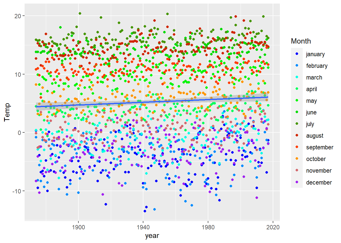
# There may be other and better ways to display these data...