STIN300 - Day 2
Lars Snipen • Jon Olav Vik
1 Today’s learning goals
- Understand the concept of a table in R.
- The basics of data.frame (HOPR) and tibble (R4DS).
- Data visualization and the first use of
ggplot(ggplot book).
I’ve added references to other learning materials below.
2 Brief recap
2.2 Scripting
https://rstudio-education.github.io/hopr/basics.html#scripts
We started our first scripts, using the workflow
- Add some comments about what to do, and possibly how to do it.
- Add a small amount of code.
- Save the script file!
- Source (run) the code, and see if it works.
- If not, try to correct the error.
- When everything looks fine, return to the top, and add more code.
2.3 R objects, data types, vectors
https://rstudio-education.github.io/hopr/basics.html#objects
In our scripts we create R objects. Such objects are typically vectors, i.e. a linear series of data. A vector can only contain one data type. Data types we have seen so far:
numeric. An object of this type can store any numberinteger. An object of this type can store an integercharacter. An object of this type can store a textlogical. An object of this type can store eitherTRUEorFALSE
We also saw that missing data is symbolized by NA. All objects can contain a NA.
Vectorized code is an important concept in R. We saw an example of this in the beer can exercise.
2.4 R Markdown
Quick start: RStudio > File > New File > R Markdown…, press OK and click the Knit button. After a few seconds, an HTML report pops up in the RStudio Viewer pane. Once you’ve admired the report, look at the sample Rmd file in more detail to see the codes that specify headings, etc.
R Markdown lets us write reports mixing explanatory text, R code and output such as tables and figures. The generation of the report from the Rmd source document is called knitting. It helps make your research reproducible: You can modify and refine your Rmd document, then easily re-knit. This also makes it easy for collaborators, supervisors or teachers to suggest fixes or refinements to your work.
2.4.1 Exercise - Chunk Output in Console
When working interactively in RStudio, you can run R code using the Run button. Note the various alternatives and their shortcut keys.
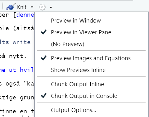
The resulting output will either display below the chunk in the Source pane (“Chunk Output Inline”) or in the Console window (“Chunk Output in Console”). You decide, using the dropdown menu at the little gear icon to the right of the Knit button.
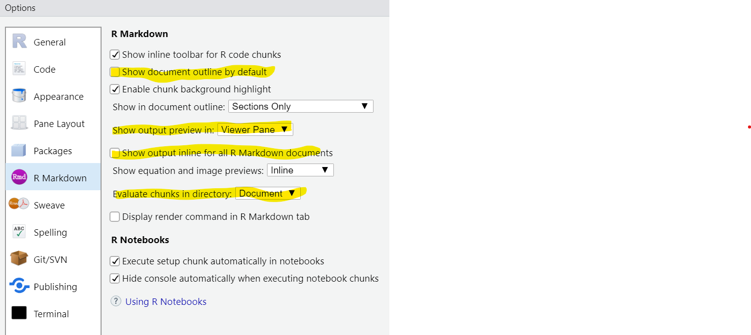
For now, set “Chunk Output in Console” as the default by deselecting “Show output inline for all R Markdown documents” under Tools > Global options. I’ve also highlighted some other settings according to my preferences:
This avoids one common source of confusion, and one bug:
- Source of confusion: When you run a line of code using Control+Enter, it may seem that it produces no output. (E.g. you expect to see a plot, but nothing appears.) This happens if your code chunk is so long that it extends below the visible part of the Source pane. Then you will have to scroll down to see the output, and that’s easy to forget.
- Bug: Sometimes if your code chunk is at the bottom of the Rmd document, RStudio may forget to expand the scroll range to make room for chunk output. Then you have no way to scroll down to see the output.
I prefer “Chunk Output in Console” so that my Source pane contains only code. Feel free to set your own preferences, as long as you understand the consequences.
2.4.2 Live coding: Beer can in R Markdown.
3 Tidyverse
Yesterday we installed the tidyverse packages. This is a collection of R packages that share a coding philosophy. In some ways this is a new way of R programming, a new ‘dialect’ of R.
HOPR does not cover tidyverse; there’s a dedicated book for that: R for Data Science (R4DS for short).
In many cases the tidyverse presents alternatives to already existing solutions in R. This means that in such cases there is a ‘base R’ way of coding and a ‘tidyverse way’ of coding solutions to the same problem. Why do we need both? Well, at least for certain applications the tidyverse approach has many followers, and it may be argued that it has some benefits. Code becomes more readable, and computations are faster. Languages are always evolving, and as new needs arise, we must expect that old solutions are no longer optimal. Still, not all facets of ‘base R’ are replaced by the tidyverse.
Over the next days we will devote our attention to the tidyverse approach, and focus on the basic parts that is most used and that we should be familiar with. We will then gradually include more of base R coding, since much of this is also needed to make full use of the tidyverse.
4 Tables in R
https://rstudio-education.github.io/hopr/r-objects.html#data-frames
https://r4ds.had.co.nz/tibbles.html
Tibble is tidyverse’s drop-in replacement for data.frame, with fewer surprises and more user-friendly behaviour.
A data table is a concept most are familiar with. It is basically a ‘rectangle’ of data, organized in rows and columns, and we know them from spreadsheets etc.
In R you should think of a table as a series of column-vectors!
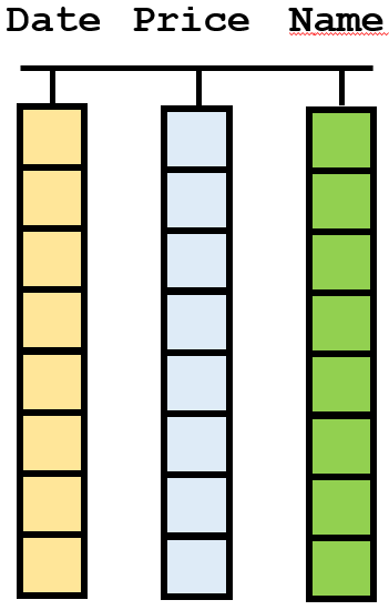
Figure 3. Visualization of a table (data.frame or tibble) in R. Notice that each column is a vector, having one data type (color) only, but that different columns may have different data types. Typically, columns also have names.
It is important that you have this focus, that each column in the table is a vector. Not the rows, the columns. This is an axiom in the universe of tidy data (the tidyverse). Each new column is a new variable in the data set, the rows are often referred to as cases or observations. All entries down a column are new entries of the same variable. All elements in the same column are of the same data type, they must be since they are vectors, right? But, different columns may be of different data types. Hence, the columns are independent of each other, and can store completely different types. If you focus on a row in the table, it can be a mix of many types, but in a column it is always one type. If you think about it, spreadsheets are also organized the same way, columns are the primary entities, not the rows.
This is also how you should try to organize your data. Never mix data of different types in the same column. And keep it as a rectangle, i.e. the exact same number of entries in all columns. Data may be missing in some cells, that is OK, but stay with the table concept. R is in many ways specially designed to handle data tables. In fact, if your data are rarely in tables, or cannot be organized as such, you should probably not use R! But, surprisingly often data can (and should) be stored as tables, and then R is indeed a powerful tool.
Some think of a table as a matrix, but we will talk about matrices later. They are not the same.
4.1 The data.frame
In base R the data structure data.frame is used to store tables.
A classical data set is the iris data, and this is available in R directly, just type iris in the Console, and it is listed.
How many rows and/or columns does this table have? Several functions in R can help you here: To get the number of columns, use ncol(iris). To get the number of rows, try nrow(iris). Try dim(iris) and you can probably figure out the output yourself.
4.1.1 Digression - environments
Why does not iris show in the Environment window?
Well, it does in a sense, but the point is that R has many environments. In the Environment window there is a pop-up in the header where it says Global Environment. This is the environment you are inspecting now. Click on this, and you will see a long list of environments. These are typically all the R packages that is loaded at present. Select package:datasets. Then you can scroll down and find the iris and verify it is indeed a data.frame with the number of rows and columns we found above.
Notice the other data sets are just listed as promise. This means they are available, but will only be loaded into memory when we make use of them. This is a way of saving memory, but still make it available.
Set the pop-up back to Global Environment, since this is the environment in which we work and that we want to monitor.
Working with environments is advanced stuff, described here if you ever need it: https://rstudio-education.github.io/hopr/environments.html
For now it can wait.
4.2 Indexing
We saw yesterday how we indexed a vector, i.e. used the brackets [ and ] to refer to elements in the vector. We do the same for data.frames, but since they have both rows and columns we must use two indices, separated by a comma:
value <- iris[1,3]        # copying element in row 1 column 3 to value
iris[2:5,2] <- 0          # setting values in rows 2 to 5 and column 2 to 0
mini.frame <- iris[1,]    # copying entire row 1 (all columns)
col.vec <- iris[,4]       # copying entire column 4
Inspect the Environment and note the difference between mini.frame and col.vec. Also, note that iris now seems to appear in the Global Environment! Since we modified its values (second line above), a copy was first made from the original to the Global Environment, and it is this copy we now work on. We are not allowed to change the package:datasets environment, which is good really…
Erase the Global Environment, using the broom (Harry Potter flying device) in the header of the Environment window, and the type iris in the Console again, and the original is re-loaded.
In virtually all cases we meet, the columns of a data.frame has names. Rows are often just numbered, but columns (variables) typically have meaningful names. Instead of referring to a column number, we often use the names instead. Here is the more common way of copying column 4, like we did above:
col.vec <- iris$Petal.Width # copying the column named Petal.WidthThe $ operator means we ‘look inside’ the object my.iris and refer to the ‘object’ (=column) named Petal.Width inside (same as . in many other programming languages). Realize now that my.iris$Petal.Width is a vector since all columns are vectors. Thus, we could also replace the second line from above with
iris$Sepal.Width[2:5] <- 0 # setting values in rows 2 to 5 and column Sepal.Width to 0Instead of indexing column 2 we use its name. Note that since my.iris$Sepal.Width is a vector, there is no comma in the brackets when indexing it. A vector is linear, and does not have rows and columns.
We can also use the $ to add a new, named, column to a table:
iris$Sepal.Area <- iris$Sepal.Length * iris$Sepal.WidthWe simply name the new column, as if it was already an existing column, and then copy something into it. It will then be created as a new column in the iris table. We will see later this week other ways of mutating a table this way.
4.3 The tibble
https://r4ds.had.co.nz/tibbles.html
In the tidyverse there is an alternative to the data.frame called a tibble. In most practical cases it does not matter if we store our data in a data.frame or a tibble. Virtually all code that handle one of them, will also handle the other.
There are a few differences between them. One has to do with indexing, as we will see below, in most cases it does not matter if we use a data.frame or a tibble, think of them both as tables.
4.4 Exercise - exploring data tables
Make a new script where you load the tidyverse. The tibble named mpg should now be available to you.
How many rows and columns does this table have?
What are the data types in each column? Hint: Just type mpg in the Console and return. Make certain the window is wide enough to fit all columns. Inspect the output.
From previously we saw the data.frame named iris. If you do the same in the Console window with this, you immediately see a difference between a tibble and a data.frame. Feed them both as input to the function str(), and observe its output.
To get a quick overview of data in all columns, use summary(mpg) directly in the Console.
If a table has numeric columns, or columns that can be converted to numeric, you can also plot the entire table. Try plot(iris) (the mpg has text columns that cannot be plotted (but that is also the case for iris you may say. No. The species column is not text, we will come back to this)).
Copy the first column from iris to the object iris.col1 using indexing. Copy the first column of mpg to the object mpg.col1 using indexing. Inspect the resulting objects. Then, repeat, but use $ and column names. What can you learn from this?
library(tidyverse)

mpg  # Implicit printing
str(mpg)
str(iris)
summary(mpg)
plot(iris)
iris.col1 <- iris[,1]
mpg.col1 <- mpg[,1]5 The grammar of graphics
To get a feel for what ggplot does, I recommend a quick look through https://ggplot2-book.org/getting-started.html
This is the title of a book by Leland McKenzie from 2006, but is very much associated with the R package known as ggplot2 that has been developed mainly by Hadley Wickham at RStudio. It is part of the tidyverse collection, and is in fact the most used of all the tidyverse packages.
Making graphics, or plotting data, is essential to all data analysis. We can roughly divide our needs for plotting into two categories:
- We need to make figure to ourselves, in order to overview and understand data
- We need to communicate results graphically to others
In the first case, simple stuff may suffice. In the second case, we should put more efforts into it. It is particularly for the second case that ggplot has been devised.
In R we again have a ‘base R’ way and the tidyverse way of doing it. The base R graphics is simpler, and we may see some examples as we go along. Using the ggplot requires more effort. This is also why we spend time on it here! In a longer perspective you should learn how to use ggplot, and that is why we make the investment here.
The reason we start already at day 2 in this course is that we need to practice and repeat, practice and repeat several times before things starts to become clear. Also, plotting data is something we do very often.
5.1 Plotting with ggplot2
The package ggplot2 has become a standard for data visualization. It will take you many hours of practice to become familiar with all its ideas and concepts, but it is probably worth the investment if data analysis and visualization is on your agenda. We will start using it here, but will only touch upon the basic use.
In order to make graphics with ggplot2 your data should be in a data.frame or tibble. Let us use the mpg data set that we have already seen. This is a tibble with fuel economy data (mpg = Mileage Per Gallon) for 38 models of car. First, we load the tidyverse:
library(tidyverse) # packages must be loaded once per R sessionIf you want to know more about the mpg data, type ?mpg and return in the Console, just as if it was an R function. Speaking of help: To get some quick guidance on ggplot2, check out the Help menu in RStudio. Scroll down to Cheatsheets, and select Data Visualization with ggplot2. It is nice to have this PDF open when working with ggplot2.
5.1.1 First plot
The coding when using ggplot2 is slightly different from what we have seen so far. Let us make a plot of the values in column hwy (highway miles per gallon) against displ (engine size/displacement, in litres):
fig <- ggplot(mpg) +
  geom_point(mapping = aes(x = displ, y = hwy))
fig  # Implicit print(fig)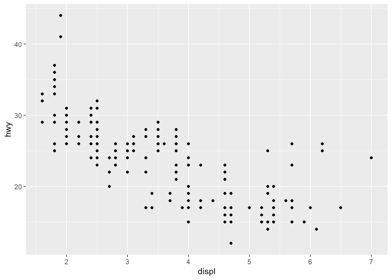
Notice that we start by creating an object (fig) and assign to it the output from the function ggplot(). At the end we actually print this, and that is when the graphics is shown. Thus, we build the plot gradually during our call to ggplot(), and we store this in an object.
Notice also that the ggplot() function takes as input the tibble where the data are found. This statement is always present when plotting with ggplot(). Next, we add a + and a new line. We now start specifying the content of the plot, the layers.
Onto the plot we add a layer by using the function geom_point(). This mean we want a scatterplot with markers (points) of some kind. There are many functions with names starting with geom_, and we refer to them as geoms. They specify different types of plots. We may add several geoms to the same plot, as we will see soon. The different geoms take different types of input, but they all need a mapping. A mapping tells the geom which columns from the tibble to use, and how to use them. The geom_point() needs two vectors, one with values to be mapped along the x-axis, and with values to be mapped along the y-axis. Notice that we provide these as input to the aes() function, not directly to the geom itself.
Notice that we type the column-names directly, and it is understood that these are columns in the mpg that we have already specified. In R in general, we need to type mpg$displ or mpg$hwy to specify columns, but in ggplot the column names suffice. Note this difference.
The aes() function sets up the mapping from some aesthetics and give this to the geoms. We will see more of this below.
Let us briefly have a look at the plot. We notice that as the engine gets larger (larger displ), the fewer highway-miles per gallon we get (smaller hwy). There are, however, a few car models with very large engines that still seems to have a fairly low fuel consumption (large hwy). What could be the reason for this? We will see in the next section.
5.1.2 Mapping aesthetics
In ggplot it is very easy to map data in the columns to the aesthetics of our plot. What is an aesthetic? Well, it is an entity we can see on the figure, e.g. positions of markers, their colors, shapes, sizes etc. In the plot above we specified that data in columns displ and hwy should map to the aesthetics x and y, the locations along the x- and y-axis respectively. Let us now color each marker by the class column:
fig <- ggplot(mpg) +
  geom_point(mapping = aes(x = displ, y = hwy, color = class))   # mapping color
fig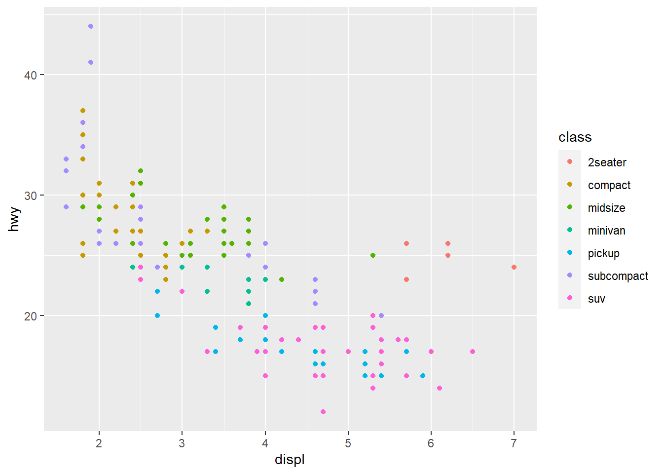
This means we mapped the values in the class column to the aesthetic color, just as we mapped hwy and displ to positions previously. Each marker we see corresponds to a row in the mpg table. The hwy-value of that row is mapped to the x-axis, the displ-value is mapped to the y-axis, and the class value (level) is displayed as a color, i.e. all cases (rows) of the same class have the same color.
Note how the legend, explaining how color maps to class, was added automatically.
We can now see that the cars with very large displ, but still fairly large hwy, are typically cars of the class 2seater. This makes sense, as these cars are typically small (low weight) despite of their large engines. They probably use little fuel due to their low weight.
5.1.3 Setting aesthetics
In the previous example we mapped colors to a column in our data. What if we want to just add the same color to all markers in the plot? Then we give the color as input to the geom_ function, not to aes():
fig <- ggplot(mpg) +
  geom_point(mapping = aes(x  = displ, y = hwy), color = "darkgreen")   # setting color
fig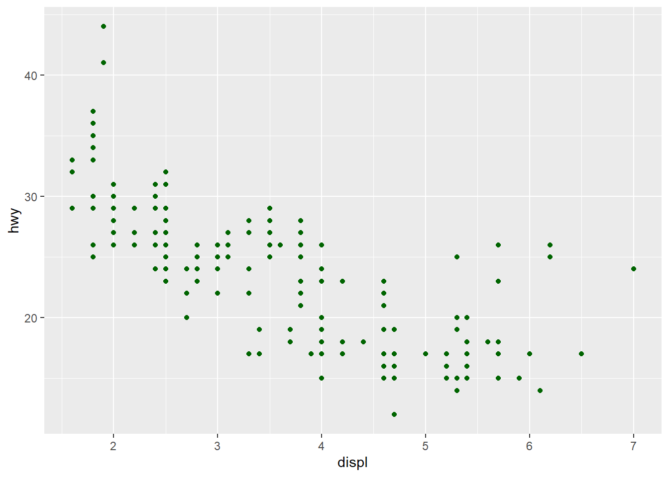
If we specify the aesthetic-argument to the aes() we must specify some data column to map it to, but if we give the same aesthetic argument to the geom_() function we must specify a color/size/shape directly.
It usually takes some time to digest the difference between mapping and setting aesthetics.
In R we have many named colors available, type colors() and return in the Console to see them listed. Sizes specify line-thickness or point diameters. The shape aesthetic changes the type of marker. It needs a code for type of marker, type ?points in the Console to see the list (scroll down the Help file).
5.2 Exercise - mapping and setting colors
Here we make 2 plots:
p1 <- ggplot(mpg) +
  geom_point(aes(x=hwy, y=displ), color = "blue")
p1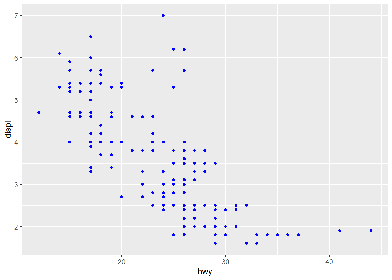
p2 <- ggplot(mpg) +
  geom_point(aes(x=hwy, y=displ, color = "blue"))
p2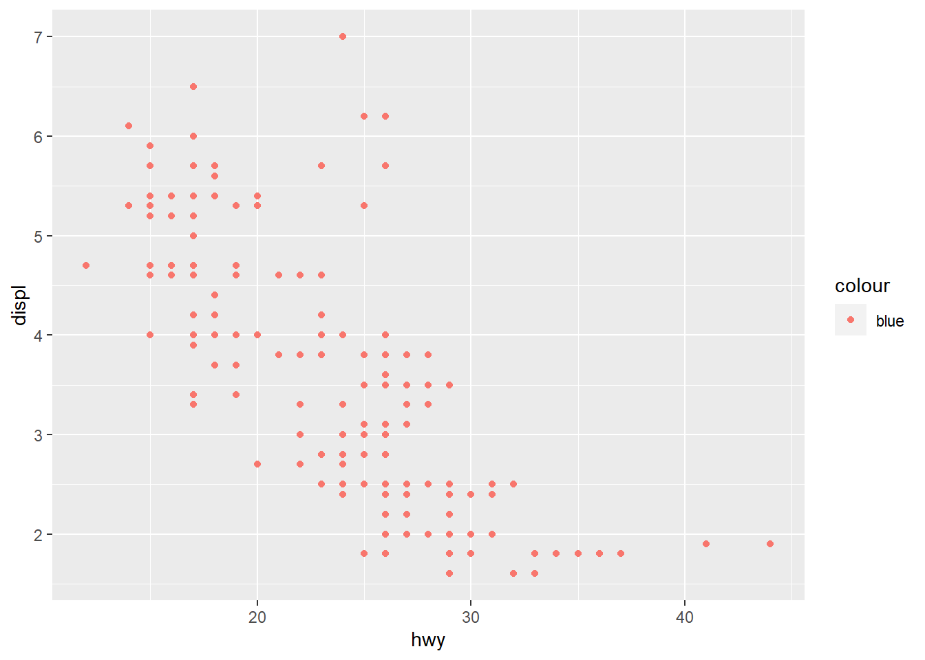
Form groups and discuss what happens here, why we get different figures. Hint: You may map to vectors outside the table given to ggplot as long as it has either 1 element or the same as the number of elements as there are rows in the table.
5.3 Exercise - mapping to other aesthetics
Color is not the only aesthetic. Try to map the class data to shape and size as well.
You may also use more than one of these aesthetics in the same plot. Change the plot to map class to color and manufacturer to shape.
The class is a discrete variable, i.e. it takes only a small set of distinct values. You may also map aesthetics to columns with continuous data. Try to map color to cty instead. This is city-miles per gallon, and we expect this to be highly correlated with hwy. Is it?
6 More geoms
We can create many different types of plots, and each type has its geom_ function. Here are some geoms we often use
geom_point()- makes a scatterplot with markersgeom_line()andgeom_path()- draws a line (curve) between points instead of markersgeom_bar()andgeom_col()- barchartsgeom_histogram()- makes histogramsgeom_density()- makes density-plots (instead of histograms)geom_boxplot()- makes boxplotsgeom_smooth()- fits a model to the data, and draws a trend-curve based on this
We will visit most of these as we go along.
6.1 Several geoms in a plot
You may add several geoms to the same plot. Let us see an example, where we extend/change some previous code:
fig <- ggplot(mpg, aes(x= displ, y = hwy)) +
  geom_point(mapping = aes(color = class)) +
  geom_smooth(method = "lm")
fig
## `geom_smooth()` using formula 'y ~ x'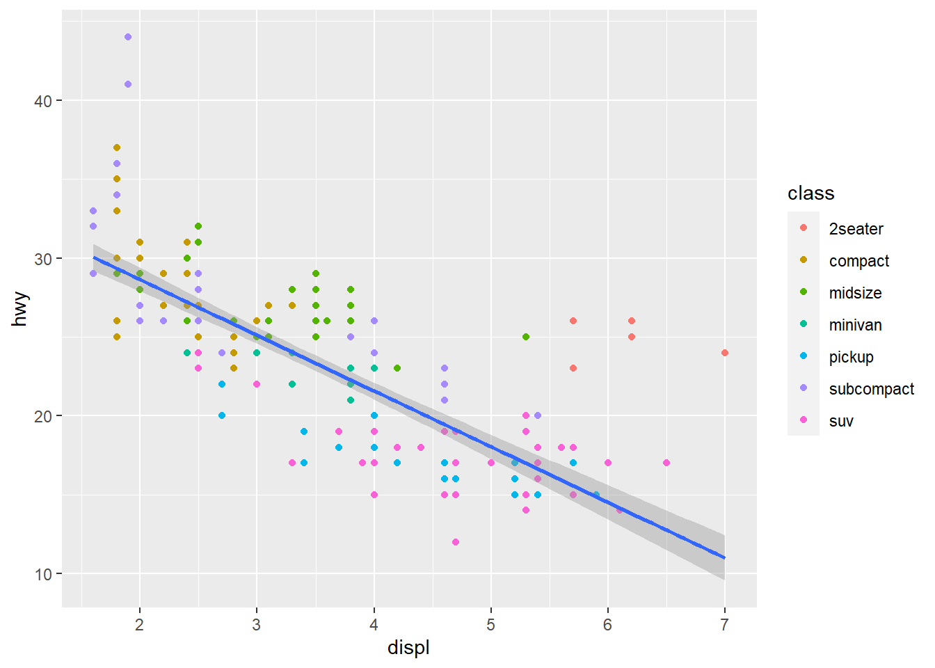
There are several things we should notice here. First, we specify aes() directly in the ggplot() function. This is possible, and means the aesthetics set here are used throughout the plot, unless overridden by the geoms. Next, in the geom_point() we add a mapping of color to class as before, but since we did not specify which columns to use for x- and y-axis the displ and hwy are used. Next, we add another layer by adding geom_smooth(). This has no specification of aes() either, which means it uses the same x- and y- columns as specified in ggplot().
Often, when we plot ‘clouds’ of data we like to see if there is some trends in the data. This is when we use geom_smooth(). It will fit some model to the data, and add a curve to the plot displaying its fitted trend. It makes use of some built-in functions in R for fitting statistical models of various kinds. We used method = "lm" above, and lm() is a function for fitting linear models. Notice that geom_smooth adds the grey shaded area around the trend curve, reflecting the uncertainty of the conditional expected value based on the fitted model. For linear models, the uncertainty is typically largest at each end of the x-axis.
There are other ways of smoothing the data, and if you have a plot with many data points, the "loess" method is better. This fits a local linear model at many x-positions, and the trend curve will adjust to any shape the data may have.
6.2 Exercise - histogram
Make a histogram of the hwy column in the mpg data using ggplot(). Use the Cheatsheet to find out how to code this. Try to add color to this by mapping to class again. Hint: Try fill as an alternative to color.
p <- ggplot(mpg) +
  geom_histogram(aes(x = hwy, fill = class), binwidth = 2)
p
6.3 Exercise - beer can plot
Extend the beer can exercise by plotting the area against the height, using geom_line().
Start out by creating a tibble containing only a column with Height:
beercan <- tibble(Height = seq(from = 1, to = 30, by = 0.1))Then add a column with computed values for Radius and then another column with computed values for Area, and (gg)plot.
beercan <- tibble(Height = seq(from = 1, to = 30, by = 0.1))
beercan$Radius <- sqrt(500/(pi * beercan$Height))
beercan$Area <- 2 * pi * beercan$Radius^2 + 2 * pi * beercan$Height * beercan$Radius
p <- ggplot(beercan) +
  geom_line(aes(x = Height, y = Area))
print(p)
6.4 Densities and more aesthetics
An alternative to a histogram is a density plot. It is a ‘smoothed histogram’. Densities are also nice for showing the distribution of data in various subsets of the cases:
fig <- ggplot(mpg) +
  geom_density(aes(x = hwy, fill = class), alpha = 0.3)
print(fig)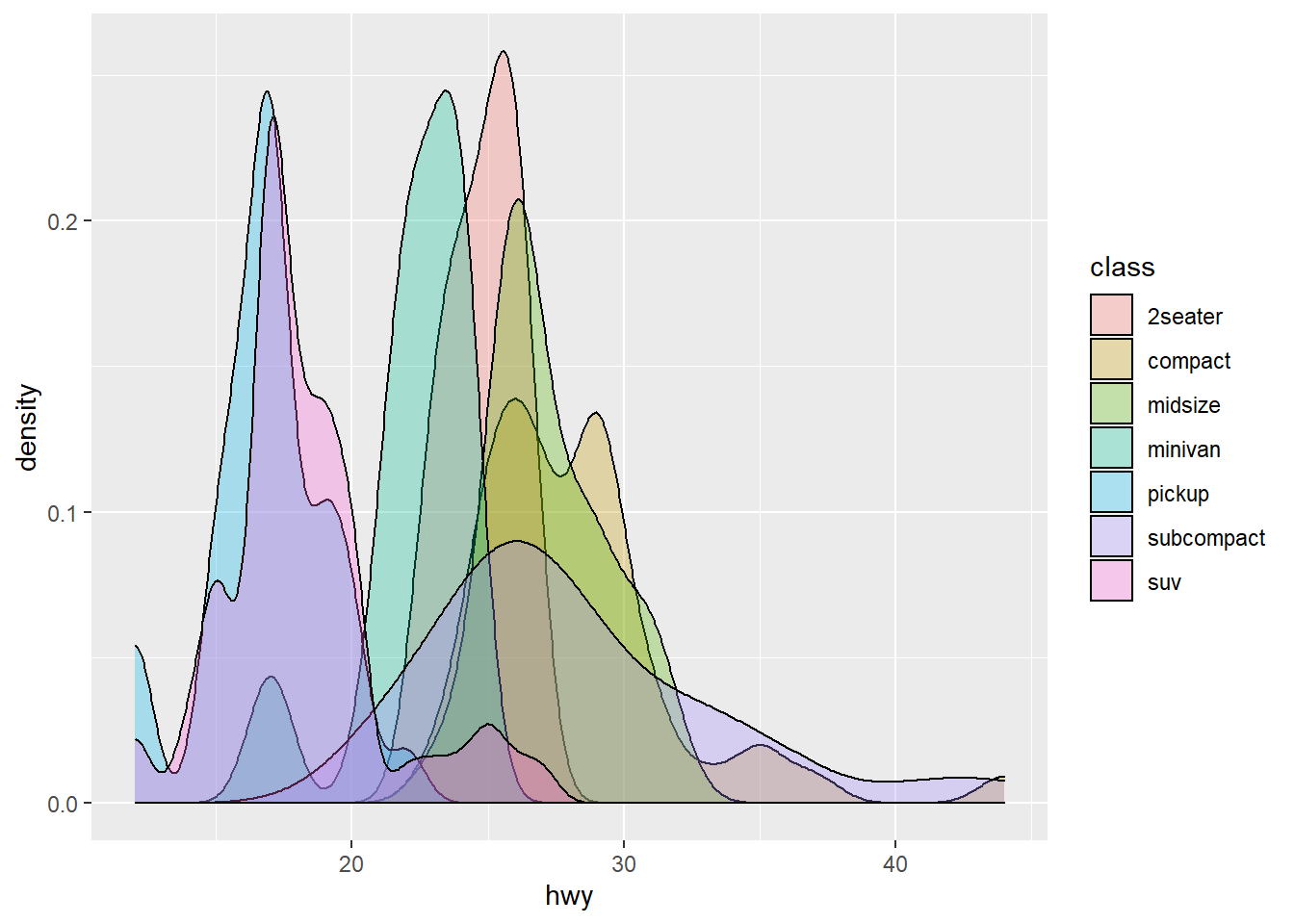
Notice the use of fill and alpha. The fill aesthetic also adds color, but to the interior, not the borders. Try to use color instead of fill and observe the difference. Notice how we map the class column again, to fill this time, and geom_density() then split the cases into groups and computes one density for each group.
The alpha aesthetic indicates transparency, with alpha = 1 the maximum (no transparency, which is default) and alpha = 0 the minimum (invisible). We typically use the alpha aesthetic when we plot many objects in the same diagram, and we want to ‘see through’ them to some degree. Vary the alpha value above, and observe the effect.
6.5 Changing other looks
Some aspects of the plot appearance is not directly related to data.
One of the very first changes we would make to a plot, is to change the texts on the axes, and possibly add a title. This is most easily done by adding another layer using the labs() function:
fig <- ggplot(mpg, aes(x = displ, y = hwy)) +
  geom_point(mapping = aes(color = class)) +
  geom_smooth(method = "lm") +
  labs(x = "Engine size (litres)",
       y = "Highway miles per gallon",
       title = "My chosen title")
print(fig)
## `geom_smooth()` using formula 'y ~ x'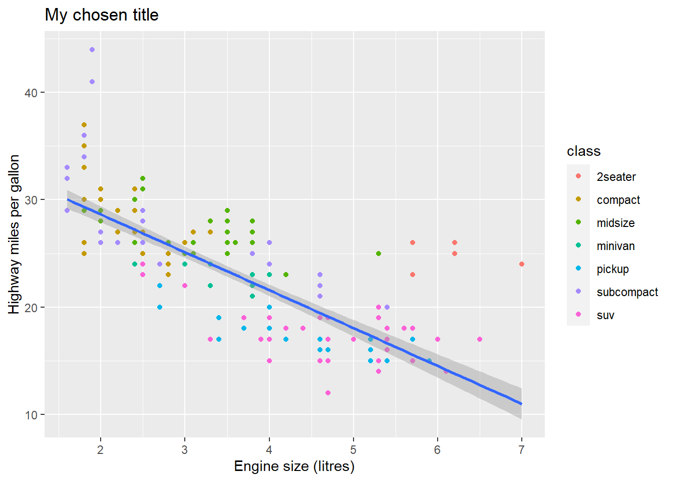
The labs() function takes several arguments, and x, y and title are perhaps the most used.
Way too often we see too small fonts on all the texts in figures. You can set this by the theme() function, like this:
fig <- ggplot(mpg, aes(x = displ, y = hwy)) +
  geom_point(mapping = aes(color = class)) +
  geom_smooth(method = "lm") +
  labs(x = "Engine size (litres)",
       y = "Highway-mile per gallon",
       title = "My chosen title") +
  theme(text = element_text(size = 15))
print(fig)
## `geom_smooth()` using formula 'y ~ x'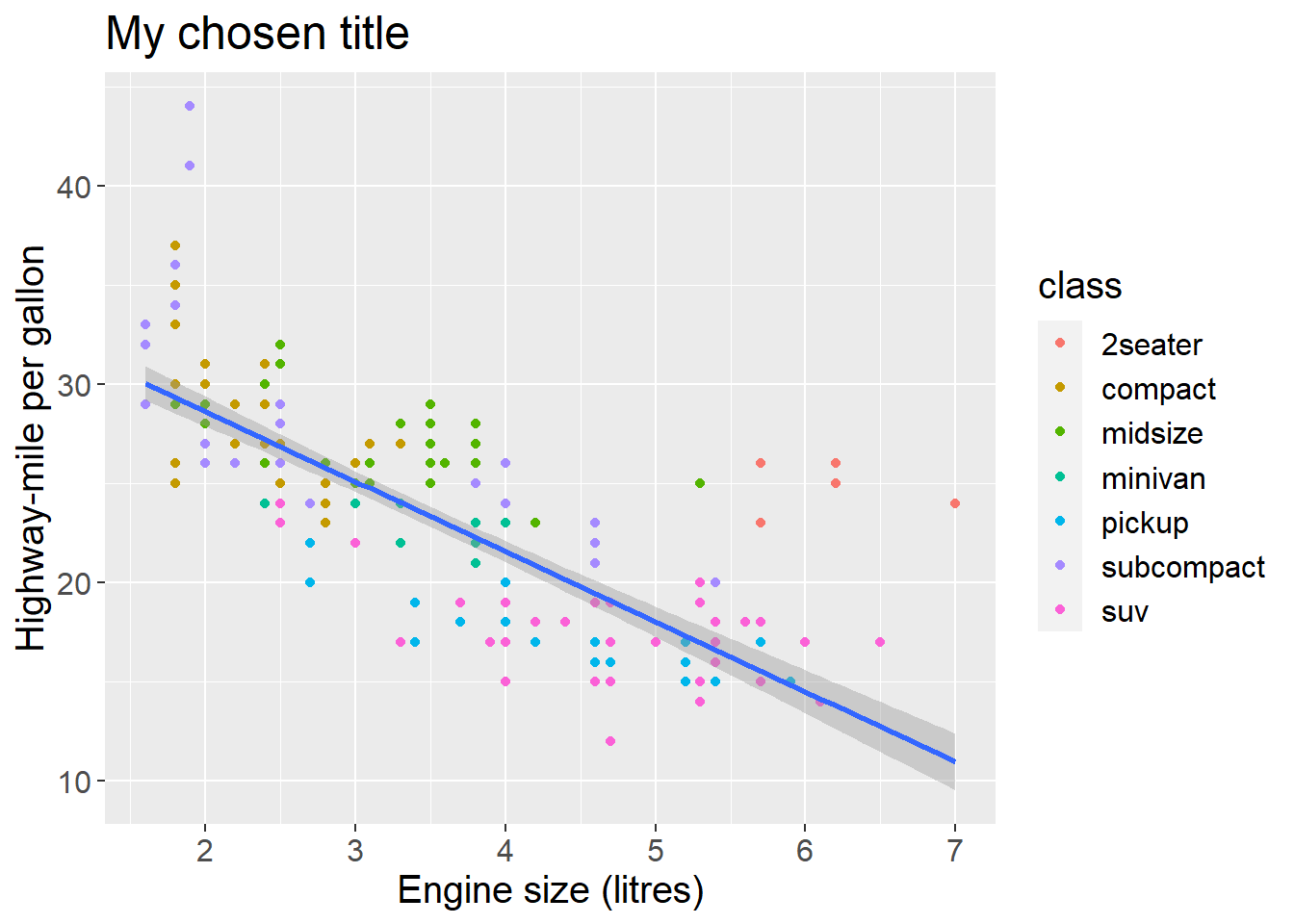
This will set the font size for the entire plot.
Notice how we extend an existing plot-code by adding new lines (layers) using the + operator at the end of all lines except the last. This is characteristic of the grammar of graphics. We gradually build figures by adding some code, look at the plot, add/change the code, and so on.
What takes time is to learn to know all the built-in functions you can make use of. How can you get to know them? Try the Cheatsheet mentioned above, or use Stack Overflow. Imagine you wanted to make a pie chart, then I would google: Stack Overflow pie chart ggplot
6.6 Exercise - changing legend title
In the last plot above we get a legend with the title class, the name of the column we mapped to color. Google to find out how you can change this to the text "Car type".
fig <- ggplot(mpg, aes(x = displ, y = hwy)) +
  geom_point(mapping = aes(color = class)) +
  geom_smooth(method = "lm") +
  labs(x = "Engine size (litres)",
       y = "Highway-mile per gallon",
       title = "My chosen title",
       color = "Car class") +
  theme(text = element_text(size = 15))
print(fig)
## `geom_smooth()` using formula 'y ~ x'6.7 Exercise - boxplot
Below is a scatterplot, and the code that produced it. Edit the code to make a boxplot instead. Use the Cheatsheet or google to find out how to. What does a boxplot actually display?
scatter <- ggplot(mpg) +
  geom_point(aes(x = class, y = hwy))
print(scatter)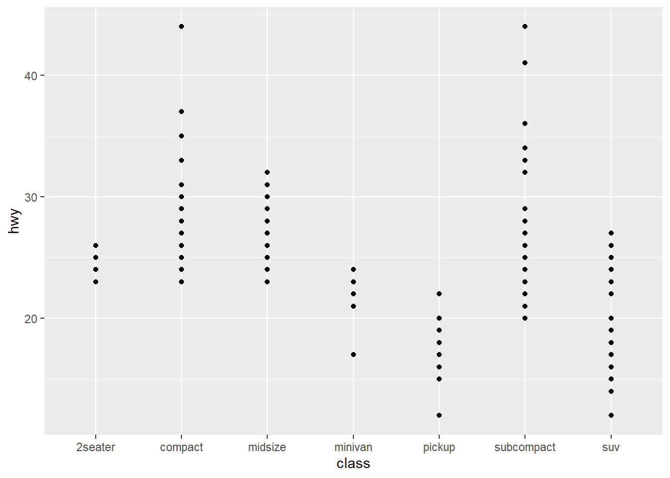
boxpl <- ggplot(mpg) +
  geom_boxplot(aes(x = class, y = hwy))
print(boxpl)
6.8 Exercise - bar charts
Make the code that creates this plot. This is a bar chart.
p <- ggplot(mpg) +
  geom_bar(aes(x = class, fill = class))
print(p)
Look up the Help file for this geom. What is the difference between geom_bar() and geom_col()?
Hint
geom_bar() defaults to counting the number of observations (rows) that have each value of x. It puts those values on the x axis, and the counts on the y axis.
geom_col() uses the given x and y directly.
So if you have precomputed counts, use geom_col().
?geom_bar and ?geom_col are documented together with stat_count(), which is the default stat for geom_bar(). You can see this from the argument list to geom_bar: It contains stat = "count".